A system that needed rethinking
I came onto the Hilton Meetings and Events project hearing about the issues with the platform. Meetings and Events hadn’t been updated since the late 1990s and many projects started and stopped due to technical tie-ups and time constraints. It was our group that was tasked with ending those issues and getting Hilton into a competitive place with its online booking meetings and events solution.
My role on this project was UX Architect. I handled all research generation, user testing, synthesis, and share out. On the design side, I handled user flows, wireframes, and prototypes.
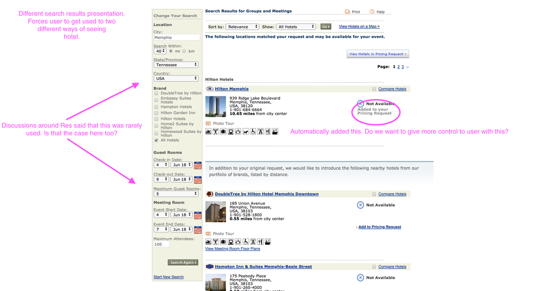
An example of the old website. One of my first days on the project was auditing the original experience.
Understanding the Landscape
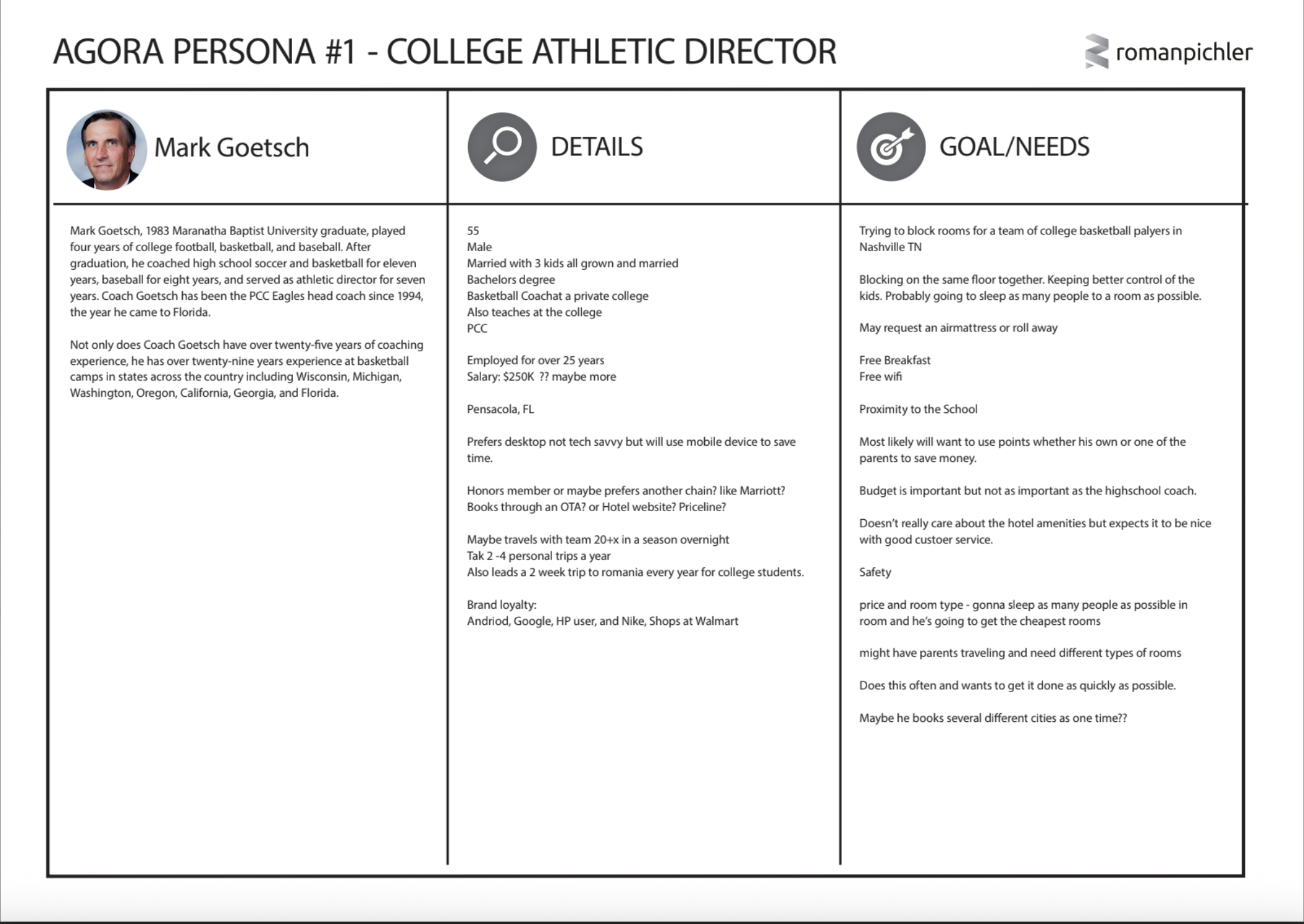
The main starting question for me was figuring out the meetings and events landscape and the main user type of our initial solution. To help figure this out, I looked through decades past research, created a current site map, conducted a comparative audit of similar solutions in the space, generated proto-personas with stakeholders, visual designers, and the product manager, and led a brainstorming session in which we generated “how might we’s?” for each persona type.
It gave us a nice starting point, but as the project moved along we came into a question with stakeholders with our personas and how to best solve our main use case in our original viable product release.
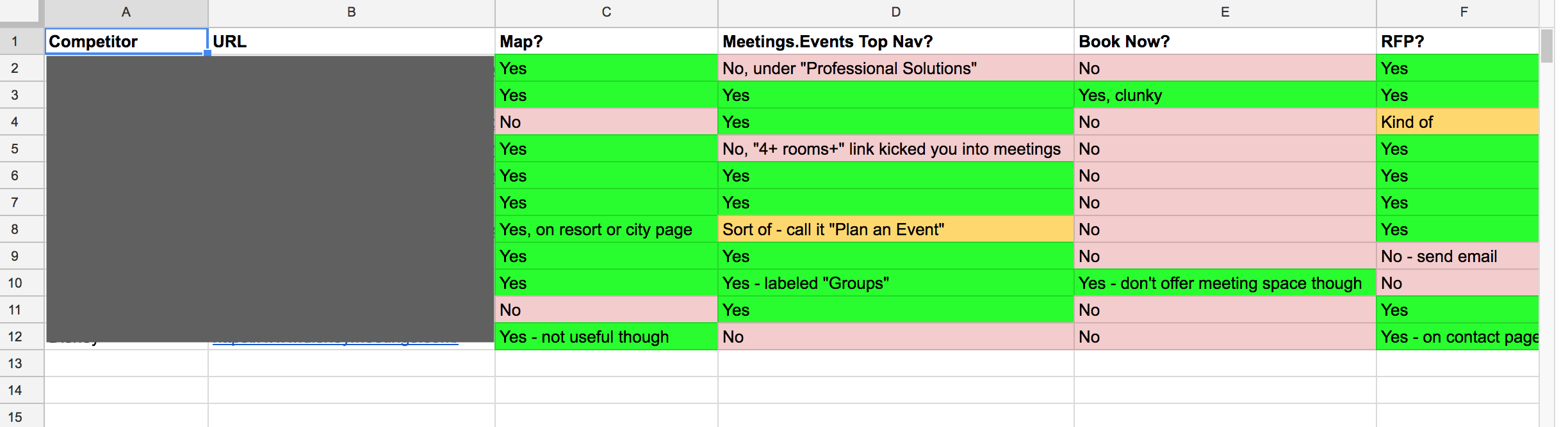
The competitor audit I completed in the beginning phases
of the project.
Using Data to Chart a Path Forward
While in the midst of the project our team and stakeholders came into a disagreement about scope of the project. Our stakeholders were incredibly knowledgeable about the industry and we relied on them heavily to understand the in’s and out’s of how meetings and events worked.
Still, we had a product we needed to ship to users. In design conversations I led with stakeholders there was a disagreement over the functionality needed in an initial release. Stakeholders felt like it was essential to allow users to book guest rooms and meeting rooms at the same time. Due to technical constraints and design We felt like we could get the 10+ guest room booking experience with Hilton Honors and solve our main use case. In our Adobe Analytics data we were seeing that our main usage (~90%) was not actually meeting planners, but traveling college and youth sports teams. So we felt confident in focusing on simplifying the guest booking process and saving meeting room features until after our first release.Taking this information to stakeholders, they agreed with our conclusions and were were settled on solving for our youth sports persona.
Testing, testing, testing
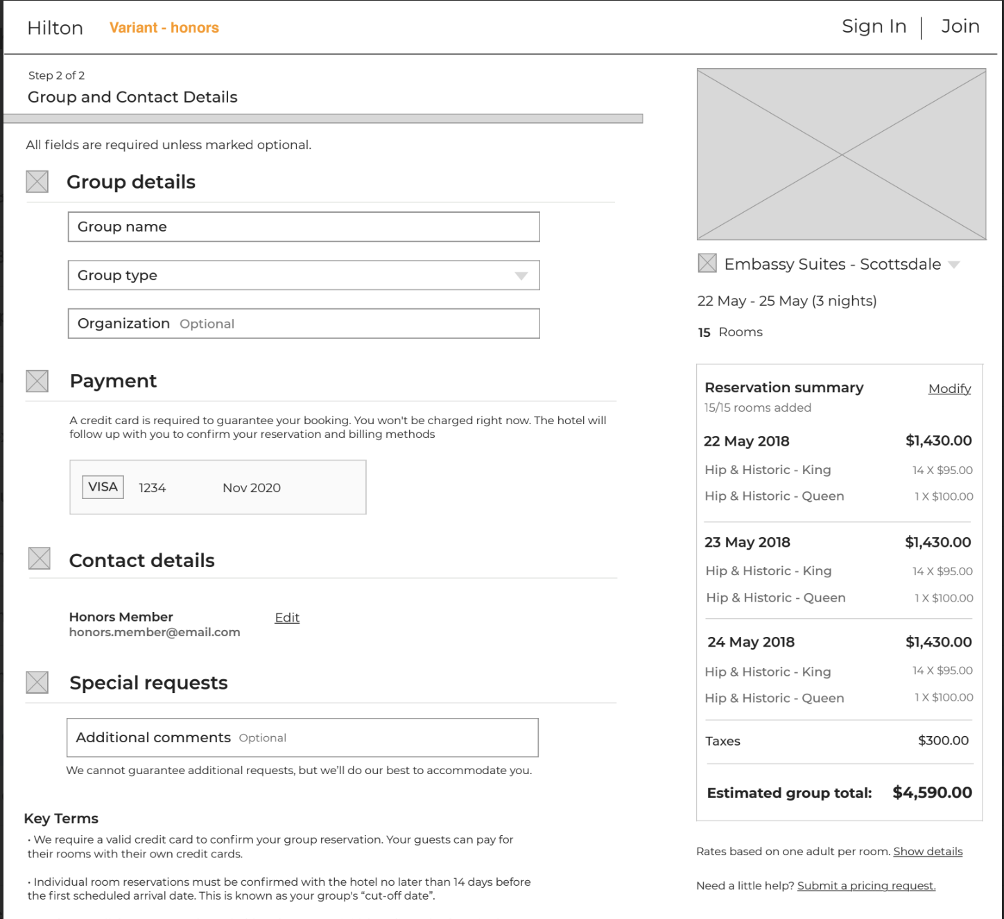
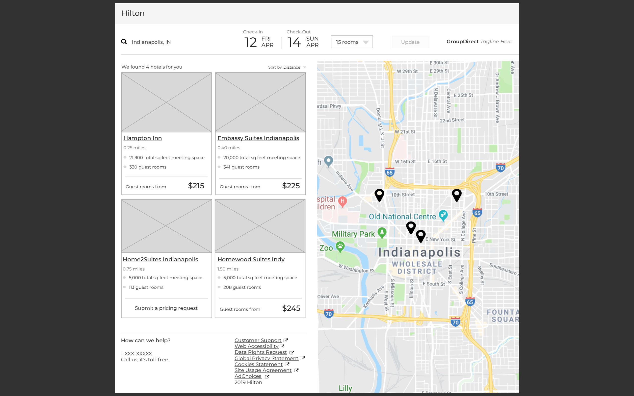
With our persona figured out, we moved into UX flows and wireframes. This is where I partnered with the usability testing team to create wireframes, prototypes, and flows and test these on usertesting.com. My main responsibility was to create usability test scripts, the prototype, synthesize the results, and carry out the learnings.
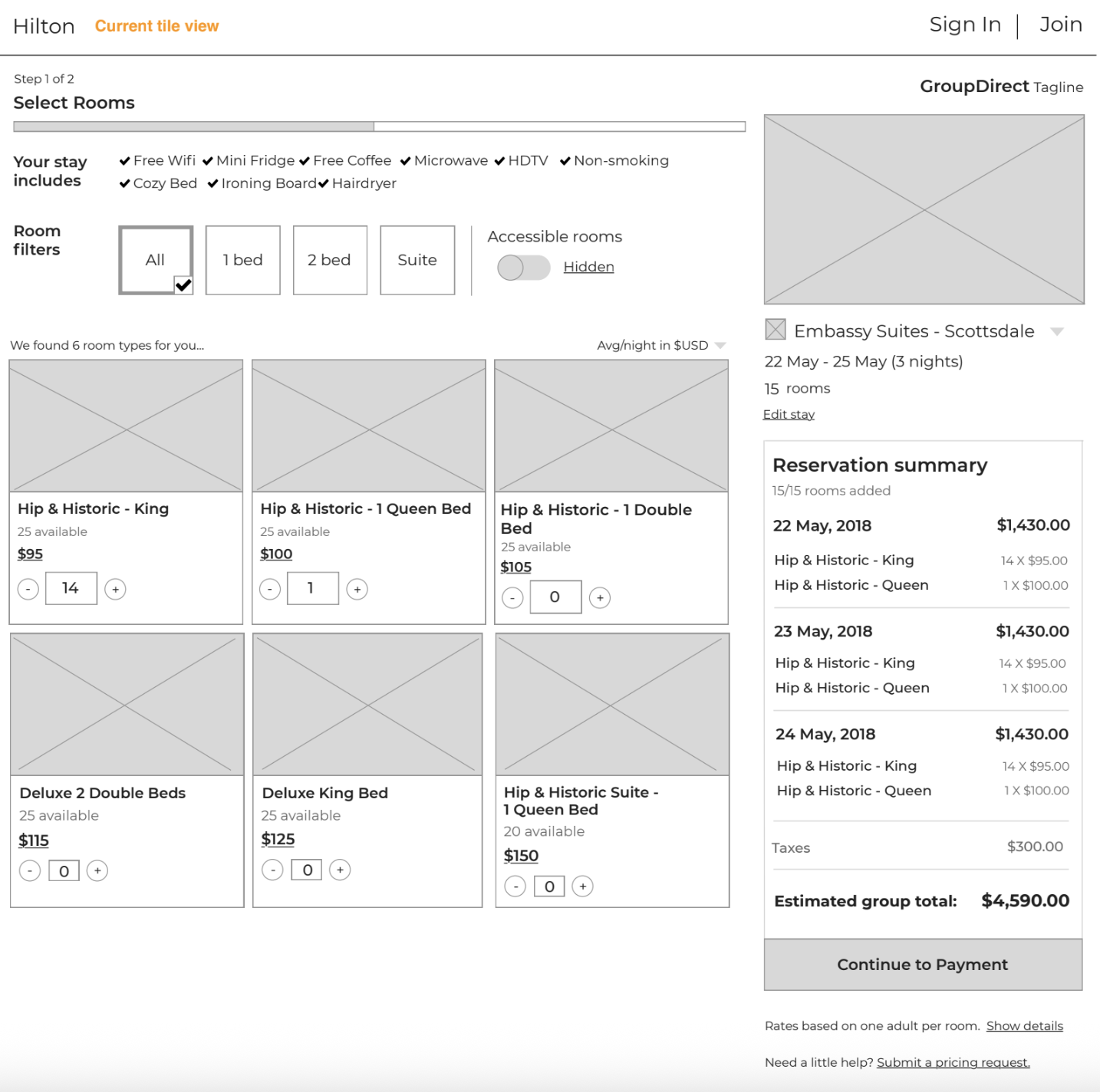
We had three pages we needed to test - our venue results search page, guest room selection page, and booking page. Our main aim was to simplify the experience. Check out some concepts I tested for each page below.

Some learnings from these tests:
- User expected some meeting room information on the Meetings and Events hotel cards.
- Users loved the real-time “Reservation summary” component as they added guest rooms and totals. As we tested, we learned that many youth sports personas paid the cost of rooms upfront, so being cost-minded was really important to them.
- Users loved the quick checkout process when including your Honors account information.
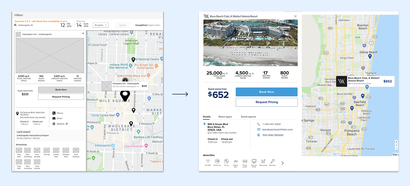
Visual Design QA and Release
After 15 years of starts and stops our team shipped Hilton’s new Meetings and Events platform in the middle of 2019!
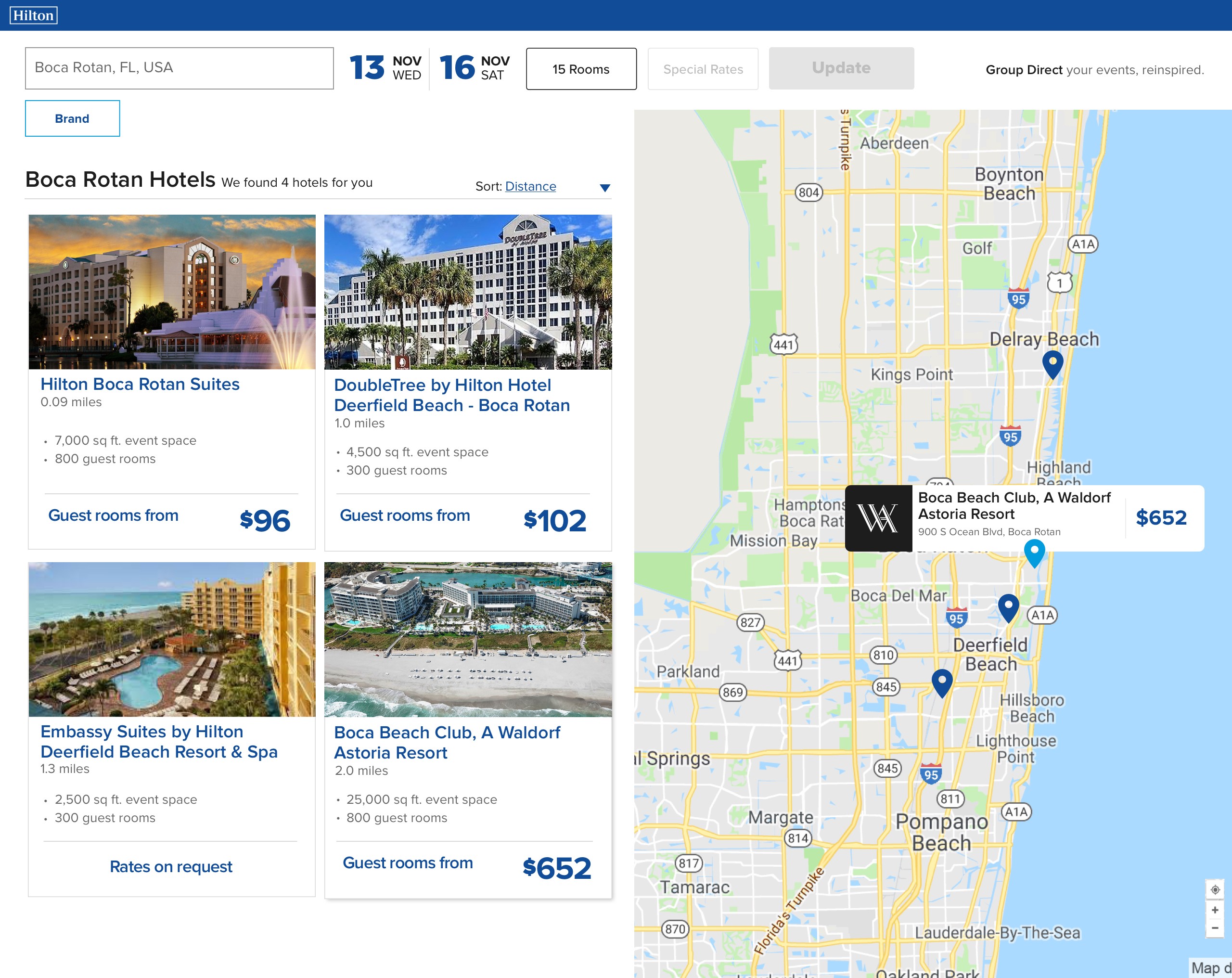
Once we felt confident about our flow and solution, I worked with our visual designer to fully mockup the experience. Our collaborative team worked within JIRA, so we were assigned tickets and attached designs when needed. You can see the shop page wireframes translated into the shop mock-ups.
Results:
- Complete overhaul of Hilton’s Meetings and Eventsspace - the first since the early 2000s