Foundations
The search team operated with A/B test experiments to see if we could improve the user experience of Eventbrite search and increase our main company metric - paid ticket orders. One area that we knew could use an improvement was web-based search. From usability testing, we knew Eventbrite’s search was difficult for a couple reasons:
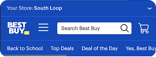
- Search was hard to find behind only a magnifying glass icon.
- Mobile search was hard due to the size of the text.
- Searches were centered less around keywords and more around quick views of events. This confused people when whatever they wanted to see a wide range of events (~80% of our users).
- Users found the search “overwhelming”.
At the same time, we saw data that said users converted at a much higher level when they actually searched. So if we could get people to search more often, we could see some positive momentum. We knew that we need to act.
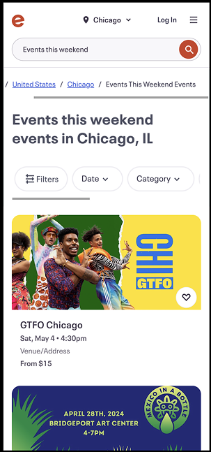
The Old Search Flow

Who We Were Solving For

Social scouts
Social scouts are the main drivers of Eventbrite. They are constantly looking for stuff to do in their area and beyond. They often pull together friends and family to attend events with them. They are curious, open-minded, and want to explore what’s out there.
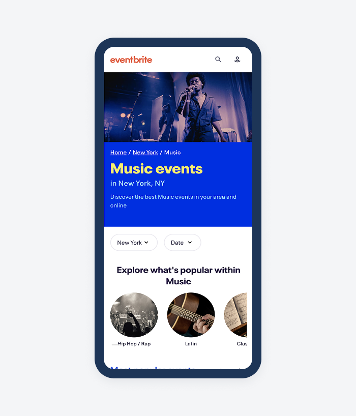
Our project aimed to introduce new category-based browse pages to allow for Social Scouts to land on Eventbrite and explore our rich inventory of 24 categories and 190 subcategories. This type of functionality did not exist on the platform at the time.
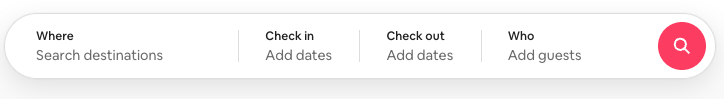
Comparative Audit
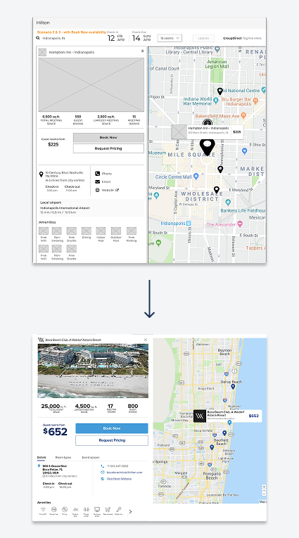
Cast a wide net in looking at search examples in many marketplaces. I kept in mind a few things when looking for examples:
- From past usability research I conducted, we knew that location was paramount to the event search experience. Nearly all examples had a location component.
- Some competitors needed to be included.
- Platforms that made the search bar more noticeable.

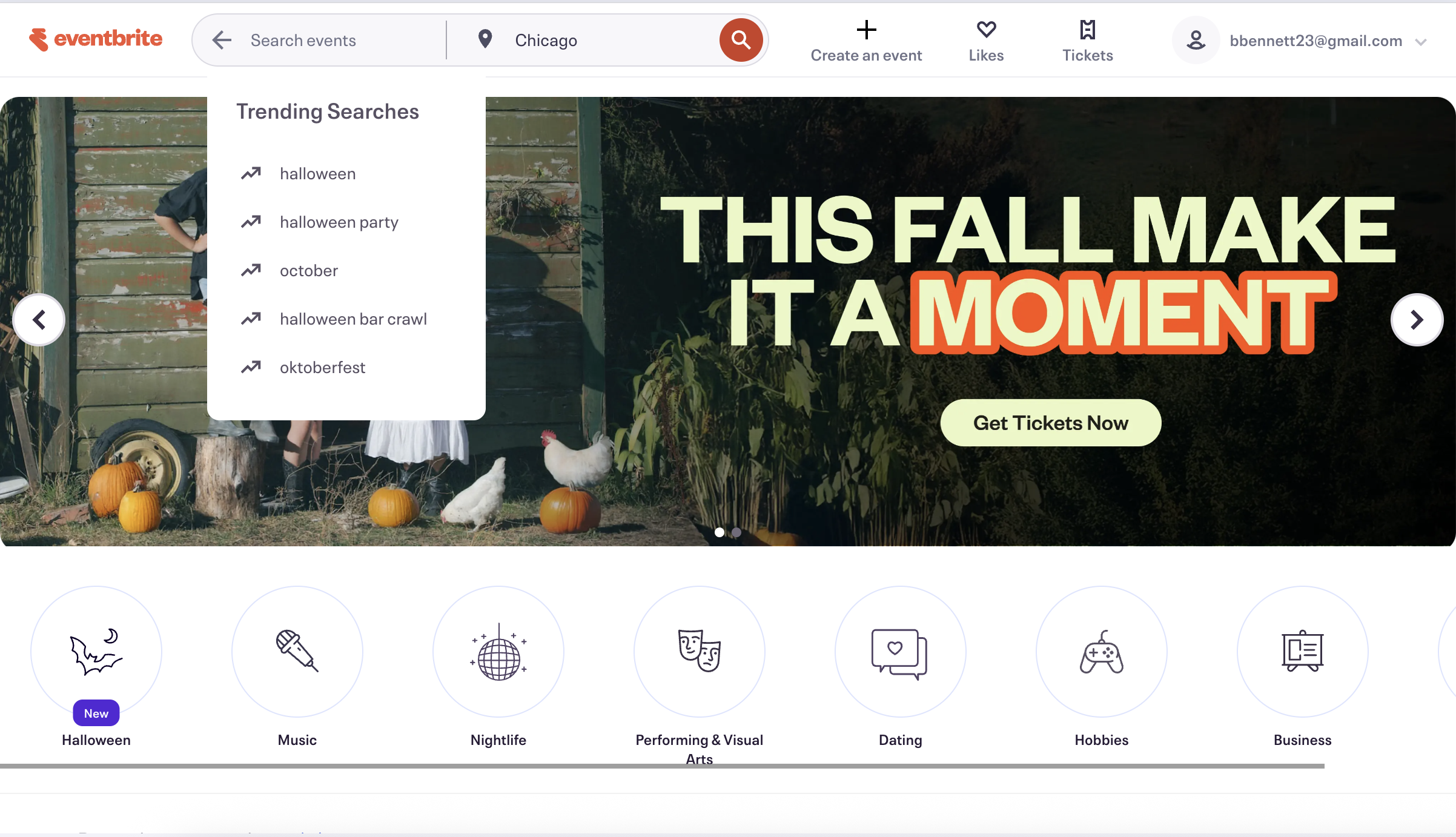
Early designs
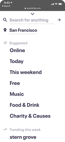
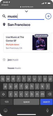
My early designs explorations focused around location placement. I felt confident in how to approach the results of the searches. We would simplify the experience and just show keywords and trending searches to help kickstart their query. The big question came with how we aimed to solve location.

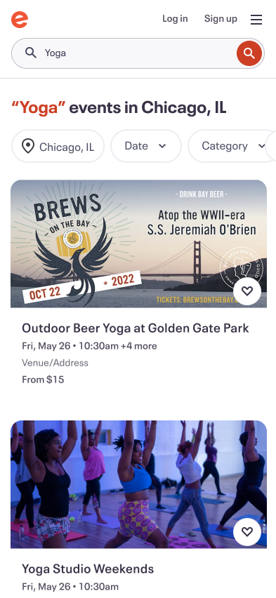
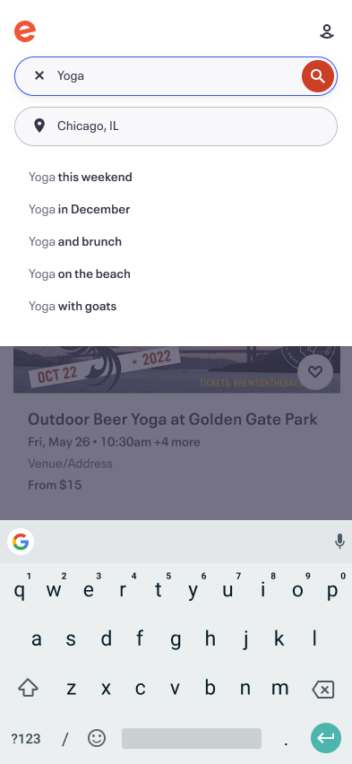
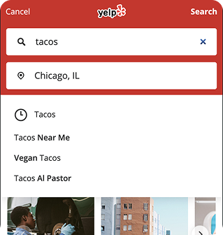
Final Designs and Flow
After taking these early designs into working sessions with the developers and our product manager, we continued to hone in on location. Due to technical restraints, we decided to keep location within the search component, unlike two examples above. This allowed us to learn faster and I still felt confident about the approach because location is referenced on search results in the headline. Check out the final flow below for logged in users.
Next steps
We achieved a huge win from this experiment! We increased search completedness (did the user execute a query) by 15%, increased orders by 254,000 a month, and increased paid orders by 4.1%. All told, we estimated that we increased revenue for the company by $419,000 per month.
Next steps for this project include continuing to iterate on location placement, showing different types of content when the user enters search (i.e. categories), and user testing with Social Scouts to try and get more qualitative feedback.
Results:
- Increase of 254,000 orders per month
- 4.1% CVR increase in orders
- Estimated $419,000 monthlyrevenue increase($5 million per year)