Problem
When consumers are getting ready to enter the event, there is nothing more critical than safe and secure ticket access. When this doesn’t happen it can mean the trust in the platform is unequivocally broken.
In 2025, Eventbrite found that they had an issue with tickets and trust in the platform. People were showing up to the door of events and not able to get to their tickets. This created frustration to consumers and the creators. Ticket-related support calls flooded in. Those that did get to their tickets expressed extreme frustration in the workflow. We knew we had to make improvements and quickly to earn back consumer and creator trust. Take a look at some consumer quotes about the issue when I entered the project in 2025.
“We couldn’t find our tickets anywhere. My husband spent over 1 hour trying to find the tickets...avoid this company if possible.”
“Very underhand way of method of selling tickets. Allows you to buy tickets...no mention that you have to set up an account to retrieve them.”
“Horribly confusing, deeply, deeply frustrating. When I want to attend an event I get an endless circle of links...this should be simple.”
Entering the Project
I came onto the project midway through after a company re-organization. I knew I had to get up-to-speed quickly. One of the first things I did was schedule short 30-minute conversations with the product and engineering partners on the project. My manager also had context on the project, so we had multiple conversations about project goals and user needs.
After these sessions and my own study in looking at qualitative feedback from app reviews and past user research, I felt more comfortable about the problem space. I also found some gaps in the research approach that I wanted to fill before suggesting improvements. My next steps were to re-create the workflow and map the journey.
Documenting the Journey
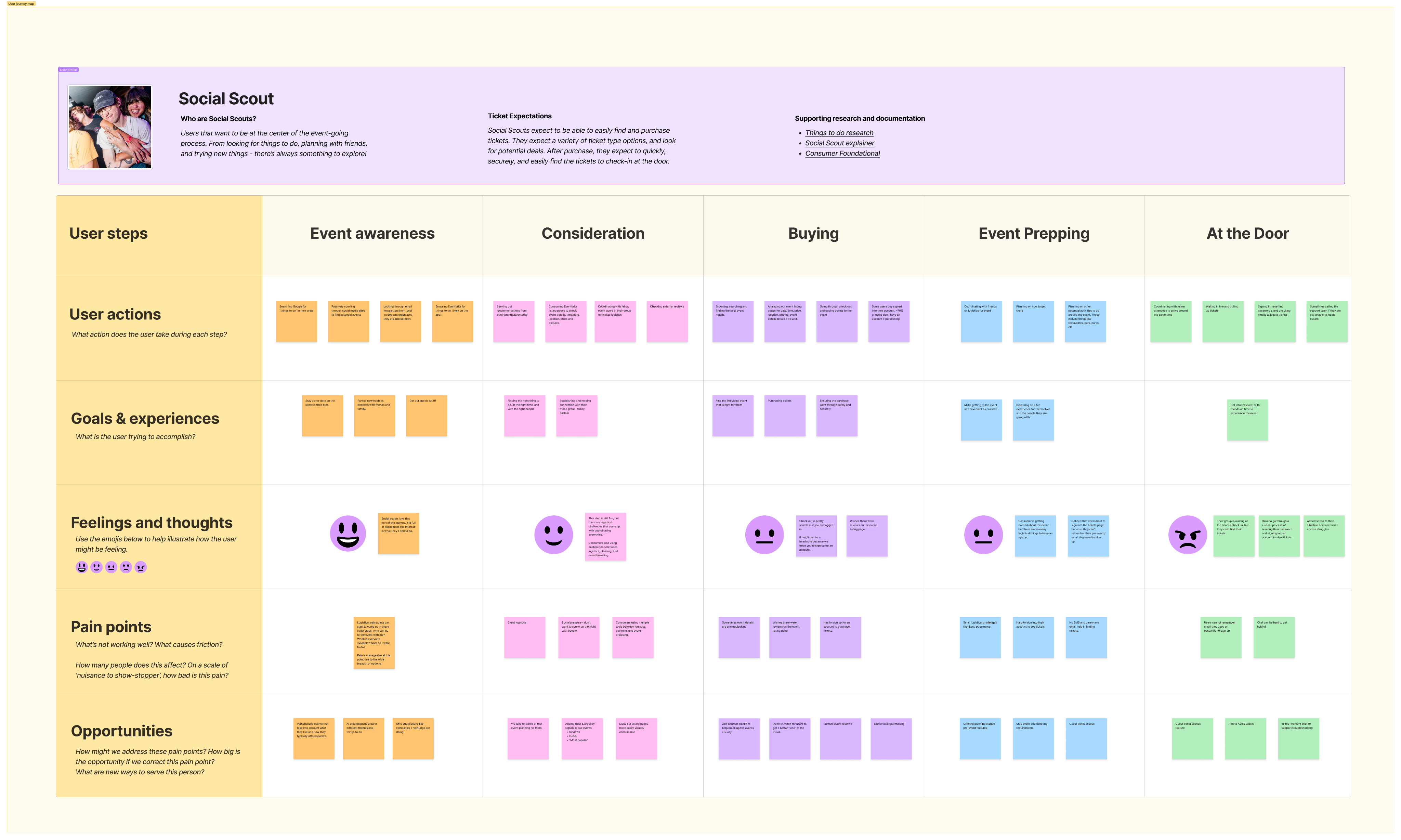
One of the things I started with was laying down the consumer journey from finding events to checking in at the door. Using this process allowed me and the team to see the experience holistically, how Social Scouts (our main user type) tries to accomplish the goal of seeing an event, and the pain points they experience, some of which come from our platform.
I shared this journey map in a working session and we started to align on areas we thought we could fix.
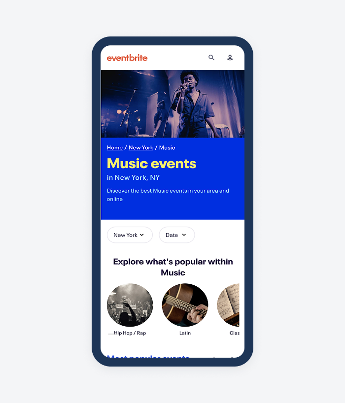
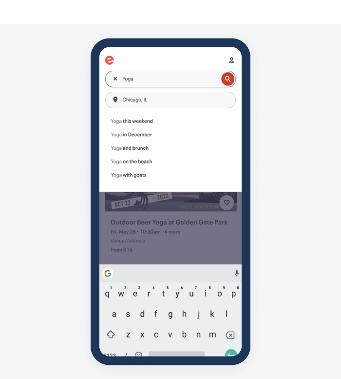
Next I wanted to show the current screenshots of the user’s experience and where the flow was breaking down for users. We are picking up the user journey when they go to their email to retrieve their tickets the day of the event.
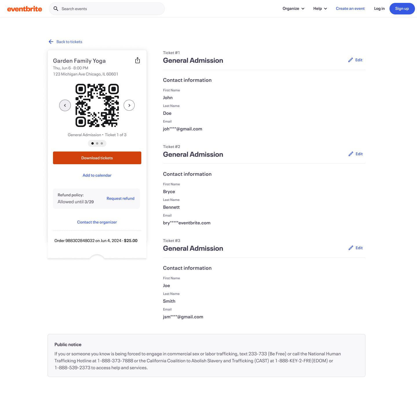
The Ticket Retrieval Breakdown
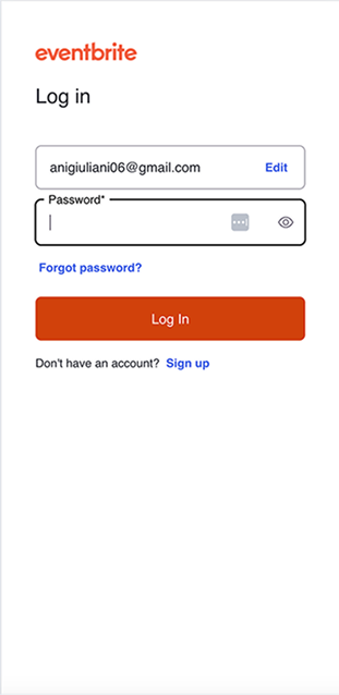
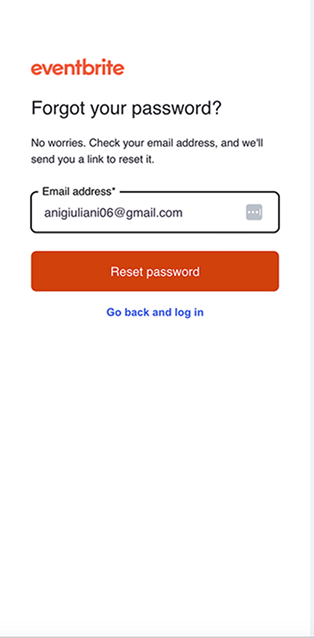
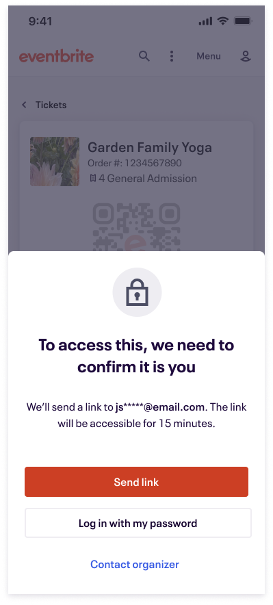
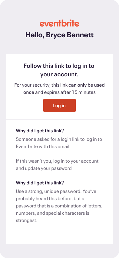
Users check their email for the confirmation email and select, “Go to My Tickets”. Instead of going to their tickets they are greeted with the log in screen. Here users expressed difficulty remembering their password and sometimes their email. So to retrieve their tickets they needed to go through the “Forgot password” flow.
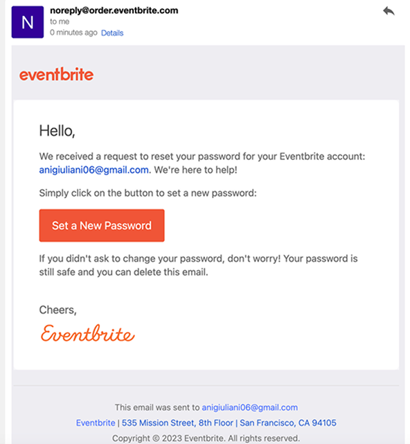
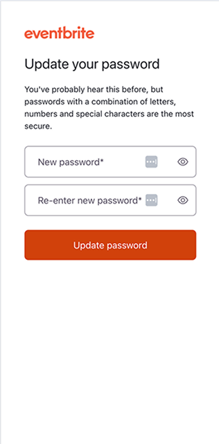
Users then had to jump back to email, finding a new email telling them to reset their password. After selecting this button, they had to enter a new password. Next they are dropped back into Eventbrite, now logged in.
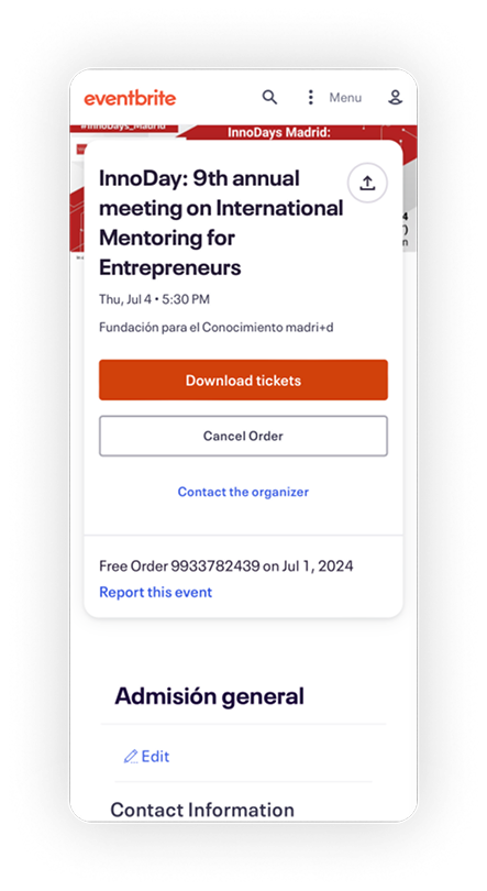
They still haven’t gotten to their tickets. They next need to select the user icon and the “Tickets” menu item. Finally, they are shown their tickets, but need to download them to their phone. In all, there are potentially 8+ steps to retrieve tickets. Often, all of this is happening as they are waiting outside the door to get into the event.
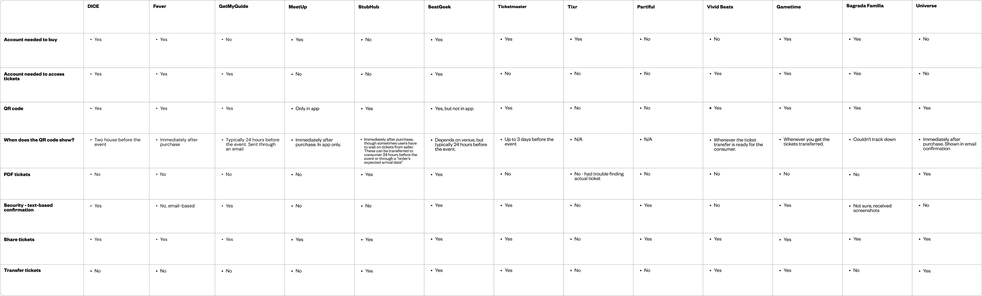
Collaboration and Comparative Audit
Platforms I documented:
- Ticketmaster
- Tixr
- DICE
- MeetUp
- StubHub
- Fever
- GetYourGuide
- SeatGeek
- Partiful
- Vivid Seats
- Gametime
- Sagrada Familia
- Universe
After creating the journey map and documenting the flow, I began collaborating with cross-functional peers. I used the artifacts in weekly working sessions as a way to unify colleagues around ticket access user problems. Through these collaboration sessions, we were able to come away with a consensus on how to approach the problem. We needed to adjust the forced login flow to make it easier for users to view their tickets close to the event.
What initially was confusing to members of the team was that a sign up/login to view was a typical pattern, and one that could guarantee the safety of the tickets. How could we solve this?
I mentioned that I could run a comparative audit of ticket purchasing experiences to see how similar platforms deal with guest ticket purchases and retrievals. I went to my manager and got some funding approval to purchase tickets and went to work auditing.
For the audit I looked at flow, feature offerings, and how specifically they handled guest ticket buying and ticket retrieval.
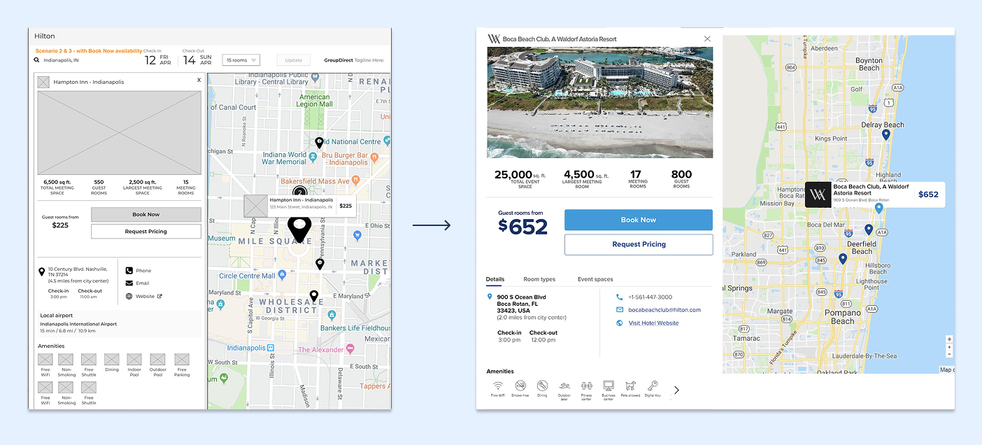
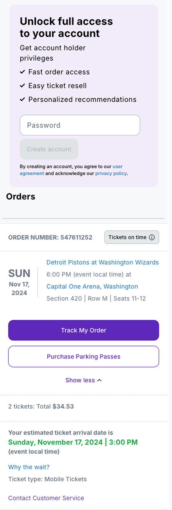
We honed in on the platforms that allowed guest ticket access. Platforms like StubHub and Universe seemed to have some overlap to what we were trying to do. Look at an example from StubHub on how both to handle guest ticketing and access. The platform allows users to guest purchase and view their tickets, but any action on the ticket required an account. This seemed like an interesting middle ground that we could explore with our platform.
We thought there were things to be inspired by but such a big change away from forcing a login would face product and security (legal) questions. I next set out to explore and get ready for a Product Review with our Chief Product Officer.
Explorations and The Big PItch
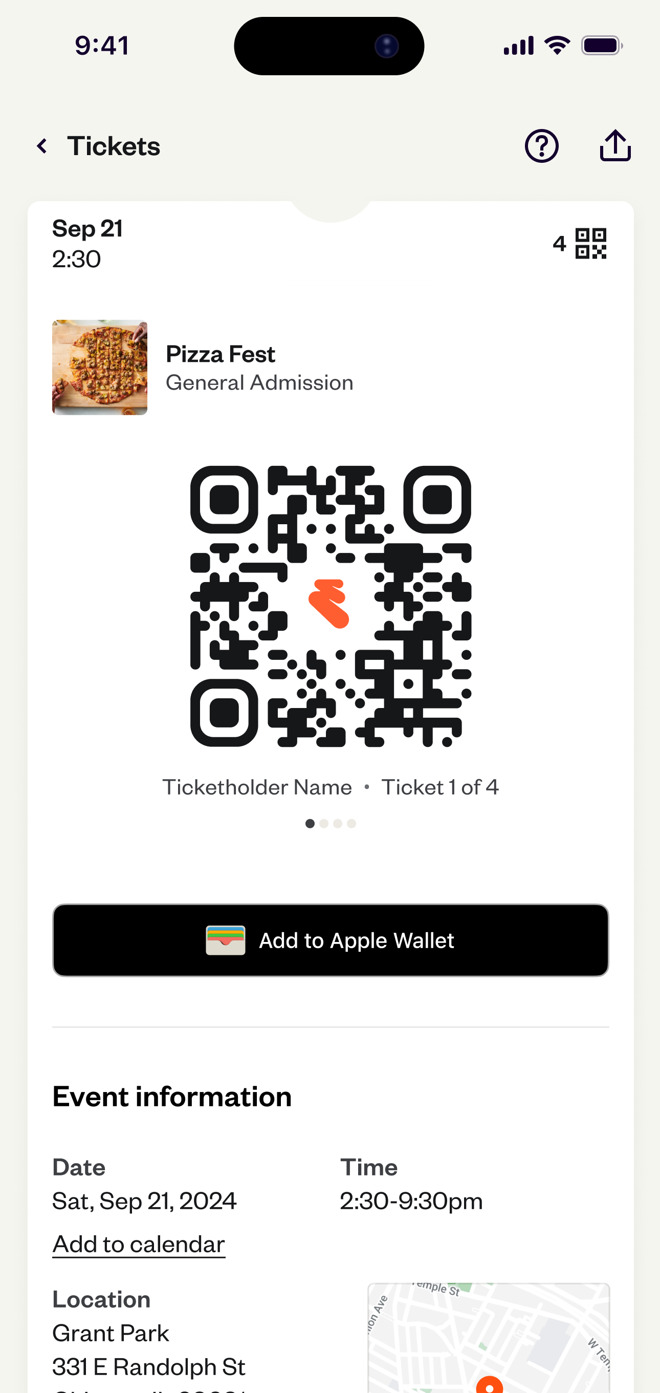
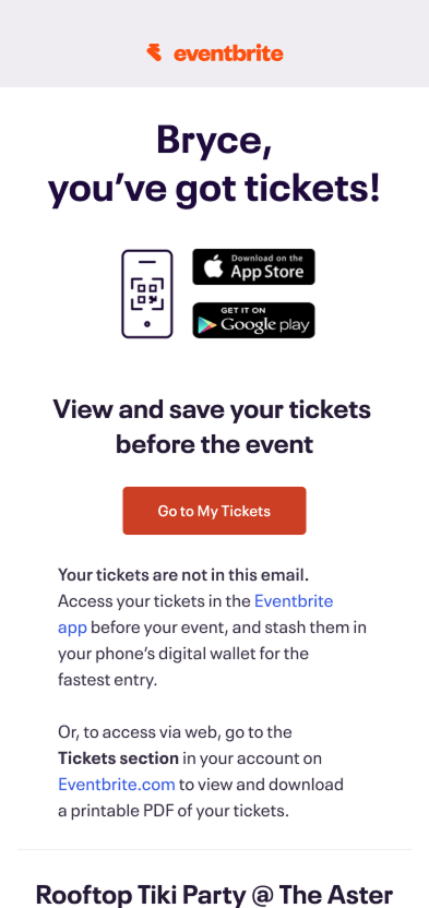
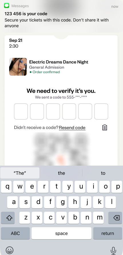
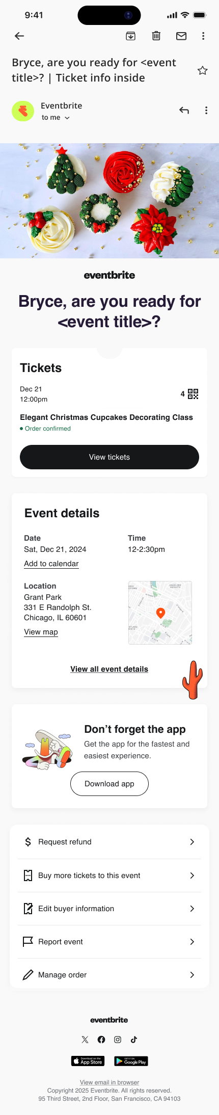
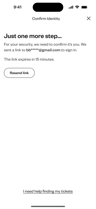
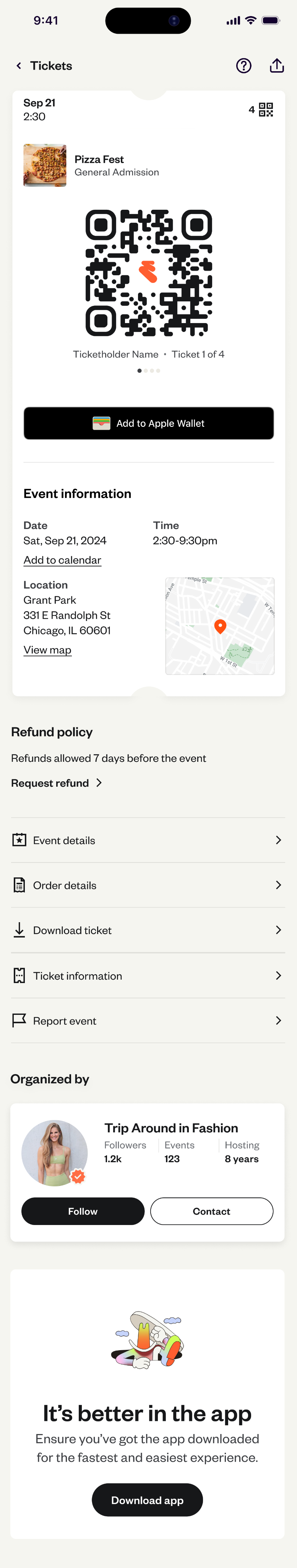
My explorations revolved around the step of jumping back into viewing their tickets. Our team thought that’s where we could bring the most value to consumers, and one of the bigger hang-ups. Through collaborative conversations with product, engineering, and legal we determined that we could show the ticket’s QR code if it was within 24-48 hours before the event. We also coordinated with a creator team to get this option added as a setting for creators. So when consumers selected the ‘View tickets” button from their email, they were taken to their tickets without the complicated ticket flow. If the consumer tried to make edits on the ticket, they needed a confirmation step through an email magic link to make that edit.
I also explored making the magic link a text code so consumers wouldn’t have to deal with going to their emails, but this was moved away from because we weren’t gathering phone numbers during the checkout process and it was out of scope for this project. This is a potential future value add for 2026. Another future value add is overhauling the styling and hierarchy of our confirmation emails. The last screenshot you see here is a concept I explored of moving to a 24-hour before email that explicitly shows a CTA to “View tickets” and has a more appealing, mobile-friendly modern design. We are also hoping for this to be a future value-add in 2026.
The clicks into the listing page raised eyebrows, especially with that number being so much larger than a typical search. We thought we should keep experimenting with the chat entry point, and continue improving the results that come back from the LLM.
Our last step before development was getting our idea approved in a Product Review with the Chief Product Officer. For this step, I collected my research artifacts, helped put them together in a narrative, and helped present alongside product, development, and design colleagues. Much of the presentation utilized my designs and research artifacts, and I answered questions from the CPO on design strategy in the project. Ultimately, everyone was enthusiastic about the potential new workflow and eagerly encouraged us to begin the development process.
Final Designs and Release
For the final designs I contributed new desktop, mobile web, and native app designs. I aligned hierarchy, brand, and offered documentation on what was happening as the user went through each step of the workflow. During the weeks of development, I frequently jumped onto design QA Slack calls with the development team to review development, and offered feedback on their progress. We were excited to see releases in all three surfaces during the late months of 2024.
Our team tracked usage data throughout 2025 and couldn’t be more excited about our work. Guest ticket access for logged out users jumped from 40% to 96%! No longer were users caught in a log in/sign up bind and could quickly get to their tickets at the door. Additionally, we saw ticket support calls fall 30%. This saves our team time, money, and allows the support team to take on other important initiatives.
Results:
- Guest ticket access for logged out users jumped from 40% to 96%
- Ticket-related support calls dropped 30%